Colour or Black and White?

No doubt this is one of the oldest conundrums, generally long-since answered. The conventional approach is that black&white is meant to be an end in itself (a choice made at the time of shooting rather than an option or fallback in processing), in order that the eye be drawn to forms and shapes and textures, appreciated for their own sake without the distractions of realistic colour. As such, you’d expect most images to work either as black&white or as colour; it can also be somewhat annoying when one sees an image presented in more than one way as though the photographer couldn’t decide. It’s even more irksome when you are that photographer. Today I reprocessed an image taken a couple of months ago, and was struck by how  it looked in the intermediate colour form before applying the intended toning.

Shapes in the Dark - colour

Shapes in the Dark – colour

Shapes in the Dark - black and white

Shapes in the Dark – black and white

In this case, I contend the two images both stand alone independently well, and they convey different things; further, the the colour gives a means of distinguishing the silhouetted trees from the surrounding foliage that the black&white image does not, making it look moodier.

A Change of Direction

Sometimes, one’s photography takes quite a turn.

A few years ago, I was all interested in large-format landscape work, when a fellow member of the photo-club inadvertently threw the spanner in the works by saying his particular approach gave results that represented how he felt at a given scene. Hang around: how come every LF landscapie I know feels exactly the same way then, if that way is defined by 5×4 format, tripod low on the ground, golden-hours (normally morning, strangely), portrait orientation, near-mid-far, Fuji Velvia film, grad-ND sky and rear-tilt perspective, amongst other things? Having seen that as a clique fashion rather than individual expression, I rejected it and promptly went digital, making a photo a day using overcast dull light to show the shapes of trees in the local woodland realistically.

Last Saturday marked something of a milestone: 4 years of posting a daily photo on Blipfoto. Over time, the idea of forcing a photo a day (especially one as considered and well-processed as I strived to achieve) has become artistically unhealthy and my enthusiasm for the site has waned considerably, so I called it a day.

In some ways, the future looks to be a return to landscape; certainly I intend shooting a lot more of it than I have previously, but I’m intending letting the inspiration drive matters not forcing it by the calendar. I’m hoping to post more often on this blog as well, but using the real camera as well as the mobile, so there’s been a bit of re-branding happening too…

So it was, on Sunday afternoon, with head slightly reeling from the decision, I set off with Dog for an afternoon stroll, with no idea how far or where we’d go except that I wanted it to be a long walk. And it was the longest we’ve been on since moving here, I think – left Portpatrick and walked past the golf course to Port Mora where I usually turn inland and walk through the Dunskey Glen, but this time I continued past Port Kale and the transmission huts (where cables came ashore for monitoring communication during the Troubles in Northern Ireland)…

IMG_20140706_140935 - IMG_20140706_140941_fused-0001.tiff_v1

Transmission huts in Port Kale, outside Portpatrick

…and with a bit of determined plodding along the Southern Upland Way, the next thing we saw was Kilantringan Lighthouse in the distance.

IMG_20140706_141852 - IMG_20140706_141905_fused-0005.tiff_v1

Kilantringan Lighthouse along the Southern Upland Way, black and white with my favoured platinum toning

It took 2.5 hours, so probably 8 miles or thereabouts, given very few photo-stops and some leisurely steep bits.

All in all, an excellent way to spend a Sunday afternoon.

My Favourite Camera Settings

14307072596_4274cbb434_b

There’s one particular combination of camera settings I keep coming back to, that forms a base for almost all my work. Just in case anyone else is interested:

13062909705_90d82315ac_b

Great Success: a replanted willow tree budding, in black and white

Circular polarizer filter: for acting as an optical control of local contrast

RAW+JPEG: so I have vast amounts of data to process properly and a reference of what the camera thought of it, which can also be recovered more easily in case of SD-card corruption (rare, but not unknown)

Mode: maybe 90% aperture-priority (auto-ISO, auto-shutter speed), 5% shutter-priority (auto-ISO), 5% manual (because the NEX-7 fixes ISO to 100 by default); of these, unless I’m doing a long exposure, the aperture is the most distinguishing control between closeup and landscape work.

Processing: black & white, so I get to think in terms of shape and form and colour-contrast even if sometimes a scene is processed for colour.

13063247864_2c71267357_b

Great Success: a replanted willow tree budding, in colour

Metering: matrix/multi-zone metering, because it’s quite good enough, especially when coupled with a histogram on-screen

Compensation: normally +1/3rd EV for reasons of expose-to-the-right, improving the signal-to-noise ratio.

Shooting: HDR +/-1 EV

The shooting-mode is a new departure; not because I’ve suddenly started “doing HDR” (I’ve been open to that workflow on demand for several years), but rather because the ability to produce 30-40megapixel photos requires multiple input images. By shooting hand-held at high frame-rate I get enough image-data to combine upscaling (using super-resolution) with noise-reduction (using stacking). Full-speed burst-mode on the NEX-7 is a very fast 10fps, which leads to taking bursts of 5-6 images by the time I’ve thought I’ve got 3; the camera enjoys a wide dynamic range so even if the scene contrast doesn’t require HDR per se, there’s only a little difference in quality and using the HDR bracketing restricts the burst to 3 frames at a time.


14178175892_3edd915e02_b

A little barn: scenery from Steel Riggs on Hadrian’s Wall

Ways of Looking at a Bollard

Well, they say photography is partly about seeing interest in mundane things. So here are five views of a simple bit of street-furniture:

  1. fisheye, defished – for an ultrawide distorted effect, the bollard in its context
  2. minimalist – all distracting elements removed for a pure study of lines
  3. abstract – reduced to a pattern of lines, curves and textures (two of these)
  4. telephoto – from afar, with moderate context

All are black and white, HDR made from 3 frames bracketed +/-1EV.

Tips for Creative Photography

If there’s a term I particularly despise, it is the “tip”; in 3 letters it makes a promise it cannot keep and belittles the photographic process into the bargain.

It is particularly repugnant when it appears in forms such as “tips for creative landscape photography: HDR”. Consider that example, and substitute the last term with any other technique that you can name – intentional camera movement (aka ICM), “use a tripod”, “use an ND filter”, “focus-stack”, “use a circular polariser filter”… what they all have in common is the tail wagging the dog, a not-entirely-latent suggestion that if you just do this one little thing, you’ll necessarily get better photos as a result. 

Not so; of course, even if the technique were used appropriately, the results are either demonstration shots, or following in the footsteps of convention.

One dictionary defines “creative” as “the ability to transcend traditional ideas, rules, patterns, relationships or the like, and to create meaningful new ideas, forms, methods, interpretations, etc”.

If a tip is something one applies to the camera in search of a panacea, creativity is what one applies from one’s head in order to bring something new to the light-table. There is a progression from “a photo of” to “a photo where” and thence to “a photo that tells a story” – yet one can still pretend to make such on any street corner. Rather, I suggest it arises from concepts as a motivational force – an idea that you so desire to represent that you go out and make it happen with whatever techniques and equipment it takes.

Timescales

I wanted to make a photo to illustrate the timescales at which things happen. That means an extreme shutter-speed, motion either obviously frozen or obviously prolonged, relative to the subjects at hand. Daffodils, shrubs and trees would blow around in the wind; with any luck, a sufficiently long exposure would capture some motion in the clouds; the Parish Church isn’t going anywhere any time soon.

So, a long exposure was chosen – over a minute – with welding glass and rubber bands – that requires the tripod. Even at its widest 18mm focal length, the kit lens only just got the width of the church in the scene, so I shot 8 photos working my way from bottom to top – that’s a vertorama, giving a massive field of view and playing with perspective distortion. As I panned up, taking exposures over a minute long, the sunlight illuminating the scene varied and obviously the sky was brighter, so I varied the exposure (both shutter time and the aperture) to avoid blowing highlights in the clouds – and that’s HDR. I wanted reasonable local contrast, both in the stonework and, critically, in the sky – that’s tonemapping. And I wanted a vintage feel – that’s black & white with warm toning.

But it’s not that I have “an HDR vertorama” to show – hopefully, what I have is a scene in which three subjects are portrayed operating at different speeds. That’s what matters.

Today, anyway.

Landscape: the approachable end of Photography

Perhaps a bit controversially, I have somewhat of a love-hate relationship with the landscape photography genre.

A few years ago now, another member in the photo-club and I were chatting about landscape. He said that he made his images using a large-format 5×4 camera and Velvia film because it “conveyed what it felt like to be there”. It set me thinking: how come I can name a large handful of photographers who all approach landscape the same way: large-format, portrait orientation, Velvia film, tripod low to the ground, rear-tilt for the perspective of a large looming foreground, grad-ND for the sky? Whatever the philosophy behind the approach – and plenty of books have been written about the philosohpy of landscape – it seemed unlikely that such a common approach actually represents an individual feeling. Seeing through the fluff, there was a trend at work, a locus of mutually derivative work – for example, there was rarely any presentation of other films, such as Provia; surely someone out there would have found that a better representation of their feeling, at least once?

My collocutor moved away from the area and left the club shortly after that; I rebelled against landscape and for a while shunned all the conventional advice of the genre: no shiny contrasty light, no wide-angle vistas, no colour, but rather, a “no-light” project, studies of the intrinsic shapes and forms of trees in the woods of Inverawe. After about 18 months, landscape began to resurface – at first, at weekends and other times when I was away from the forest. “Only on my own terms”, however.

A couple of years after the fateful conversation, the ex-member was passing by and visited the club one evening. The discussions were most illuminating: he also had abandoned the whole landscape-by-film scene, and was last heard of favouring digital sports work around the Cairngorms instead. It was satisfying to have caught up and closed the loop.


Fast-forward to now. There are phases of conformance in landscape; ignoring distasteful badly tonemapped tripe with excessive local contrast, some sites (notably 500px) feature a lot of over-bright over-saturated images. The past year or so has seen a notable rise in long-exposure work – especially in black and white, some with artistic vision, some perhaps less so. Some of my photographer contacts are now suggesting the time of the Big Stopper filter has passed as well.

Some questions to ponder:

Can one take a camera, follow a handful of guidelines and more or less guarantee coming up with a good result on any random day? (There is no one such magic guideline, but you could assign a score based on the number of things a photograph has in its favour according to a set of rules.)

If so, is landscape photography merely a programmatic sport, a way of passing the time with clearly defined start (Friday nights examining the OS map and weather forecast) and end (JPEG by Sunday night), and how does one express any originality within its scope at all?

On another hand, is landscape something that people should go out and seek to achieve, or is it that what one shoots happens to be landscape?

Relatedly, is a photograph good because you stumbled across it, or because you set out to make it, or because it exhibits a strong contrived personal style?

However it arises, when one’s photography spans several genres – both vista and intimate landscape, other nature closeups and art – it seems that viewers respond the most to landscape. It’s rather like the ITV3 or Channel 4 of photography – “human interest”, where all objects presented are approachable by virtue of being human scale, from boulders half a metre in size to buildings and hillsides that a human can at least radically alter with a suitably large digger. And that brings with it an offputting whiff of mundanity.

I can’t claim to be happy with the answers to all the above; you can’t have it all 3 ways at once.

Approach Routes

Time for something a little different.

With the previous camera, I was particularly fond of an old Pentacon 50mm f/1.8 prime lens; an awful lot of my photos were made using that, especially for closeups and even some landscapes. On the Lumix GH2, with its 2x crop-factor, this was the equivalent of shooting at 100mm-e all the time, and I was very familiar with the field of view that entailed.

Now I’ve switched to the Sony NEX-7, I’m experimenting more with wide-angle field of view. It feels completely different, as though the eye is latching-on to features of a scene I would not previously have considered using, especially the idea of perspective and lines leading into the distance.

Yesterday’s photo of the day was taken in the Fairy Glen in Portpatrick:

Between Realities

Between Realities – in the Fairy Glen, Portpatrick

and today I dug out an old Peleng 8mm fisheye lens, spent a while tweaking the screws in the M42->E-mount adapter to make it focus at all, and made this image of the approach to the harbour – a 170-degree field of view:

Approach Routes

Approach Routes

Coincidentally, both images have also been processed using LuminanceHDR for tonemapping.

Transitions

Panasonic Lumix GH2Nearly 3 years ago I spent the best part of 2 hours one afternoon in PCWorld, looking to kick the Canon habit and vacillating between a Nikon (as I recall, the D3100) and the Panasonic Lumix GH2.

On the one hand, the Nikon had excellent image-quality, but its usability was let-down drastically by the lack of a dedicated ISO button (you could pretend, by reassigning the one “custom” button – so why bother with either?) and it had what I felt was a patronizing user-interface, showing a graphic of a closing lens iris every time one changed the aperture (as though I hadn’t learned anything in the last 10 years spent working on my photography).

On the other hand, the Lumix GH2 had less than stellar image-quality, but the user-interface won me over.

Over the last 2 years, the ergonomics fitted my style like a glove: coming from film, including medium-format with waist-level finders, I find it most natural to operate looking down at the articulated LCD panel in live-view mode. I had sufficient custom presets for two aperture-priority-mode variations of black and white (one square, one 3:2, both with exposure-bracketing set to 3 frames +/-1EV) and a third, a particular colour “film emulation” and manual mode at ISO160 for long exposures, with bracketing set to 5 frames for more extreme HDR. With those 3 modes, I could cover 95% of my subject-matter from woodland closeup to long-exposure seascape and back, at the flip of a dial.

I learned to appreciate its choice of exposure parameters (normally well-considered), and to overcome the sensor’s foibles – it made an excellent test-case for understanding both high-ISO and long-exposure sensor noise and its limited dynamic range increased my familiarity with HDR, panoramas and other multi-exposure-blending techniques (all hail enfuse!). Coupled with the Pentacon 50mm f/1.8 lens, it made for some excellent closeup photos. As a measure of how workable the kit is, I once took every camera I then possessed – including medium- and large-format film – to Arran for a photo-holiday, and never used anything apart from the GH2 for the whole week.

If this all sounds like it’s leading up to something, it is. There is a long-established idea in photographer circles that gear-acquisition-syndrome (GAS), or the buying of new equipment for the sake of it or in order that it might somehow help one take better photos, is delusional. To some extent that’s right, but the flip-side is that any one camera will impose limitations on the shots that can be achieved. So I’ve established the principle that, if one can explain 3 things a camera can allow you to do better, the acquisition is justifiable.

And so I’ve switched. The new camera is a Sony NEX7[Amazon]; even though the model is barely younger than the GH2, it still has a vastly superior sensor that will give me larger images, better dynamic range and narrower depth-of-field. Indeed, at two years old, it’s still punching above its weight despite the pressure from some of the larger dSLRs to have come out since.Wee Waterfall (2)

One of the things I learned from the GH2 is that it always pays to understand one’s equipment. For this reason, the first 100 frames shot on the NEX-7 fell into 4 kinds:

  1. studying noise with varying ISO in a comparatively low-light real-world scene (stuff on bookshelves in the study – good to know how noise and sharpness interplay in both the darkest shadows and midtones)
  2. building a library of dark-frame images at various ISO and shutter-speed combinations (taken with the lens-cap on, for a theoretically black shot – any non-zero pixels are sensor noise)
  3. building a library of lens correction profiles – taking images of a uniform out-of-focus plain wall to compare vignetting at various apertures and focal-lengths on both kit lenses
  4. studying kit-lens sharpness as a function of aperture – discussed previously.

Impressively, I could just load all these images into RawTherapee and easily move them into relevant directories in a couple of right-clicks, and from there I spent the rest of the evening deriving profiles for ISO noise and sharpness with automatic dark-frame-reduction and actually measured vignetting correction – because I know very well how much time it will save me in the future.

Despite having played with film cameras, I’m quite acutely aware of the change in sensor format this time: in moving from prolonged use of micro-4/3rds to APS-C, I can no longer assume that setting the lens to f/8 will give me everything in focus at the lens’s sweetspot, but have to stop-down to f/11 or even further. The tripod has already come into its own…

So there we go.

Oh, and the complete GH2 kit is for sale on ebay, if anyone wants to buy it!
Update 2014-02-02: the complete kit sold on eBay for a very reasonable sum!


Knowing Your Lenses

Analysing Lens Performance

Background

Typically, when a manufacturer produces new lenses, they include an MTF chart to demonstrate the lens’s performance – sharpness measured as the number of line-pairs per millimetre it can resolve (to a given contrast tolerance), radially and sagitally, varying with distance from the centre of the image. While this might be useful before purchasing a lens, it does not make for easy comparisons (what if another manufacturer uses a different contrast tolerance?) nor does it necessarily well reflect the use to which it’ll be put in practice. (What if they quote a zoom’s performance at 28mm and 70mm f/5.6, but you shoot it most at 35mm f/8? Is the difference between radial and sagittal sharpness useful for a real-world scene?)
Further, if your lens has been around in the kit-bag a bit, is its performance still up to scratch or has it gone soft, with internal elements slightly out of alignment? When you’re out in the field, does it matter whether you use 50mm in the middle of a zoom or a fixed focal-length prime 50mm instead?
If you’re shooting landscape, would it be better to hand-hold at f/5.6 or stop-down to f/16 for depth of field, use a tripod and risk losing sharpness to diffraction?
Does that blob of dust on the front element really make a difference?
How bad is the vignetting when used wide-open?

Here’s a fairly quick experiment to measure and compare lenses’ performance by aperture, two ways. First, we design a test-chart. It’s most useful if the pattern is even across the frame, reflecting a mixture of scales of detail – thick and thin lines – at a variety of angles – at least perpendicular and maybe crazy pseudo-random designs. Here’s a couple of ideas:

Method

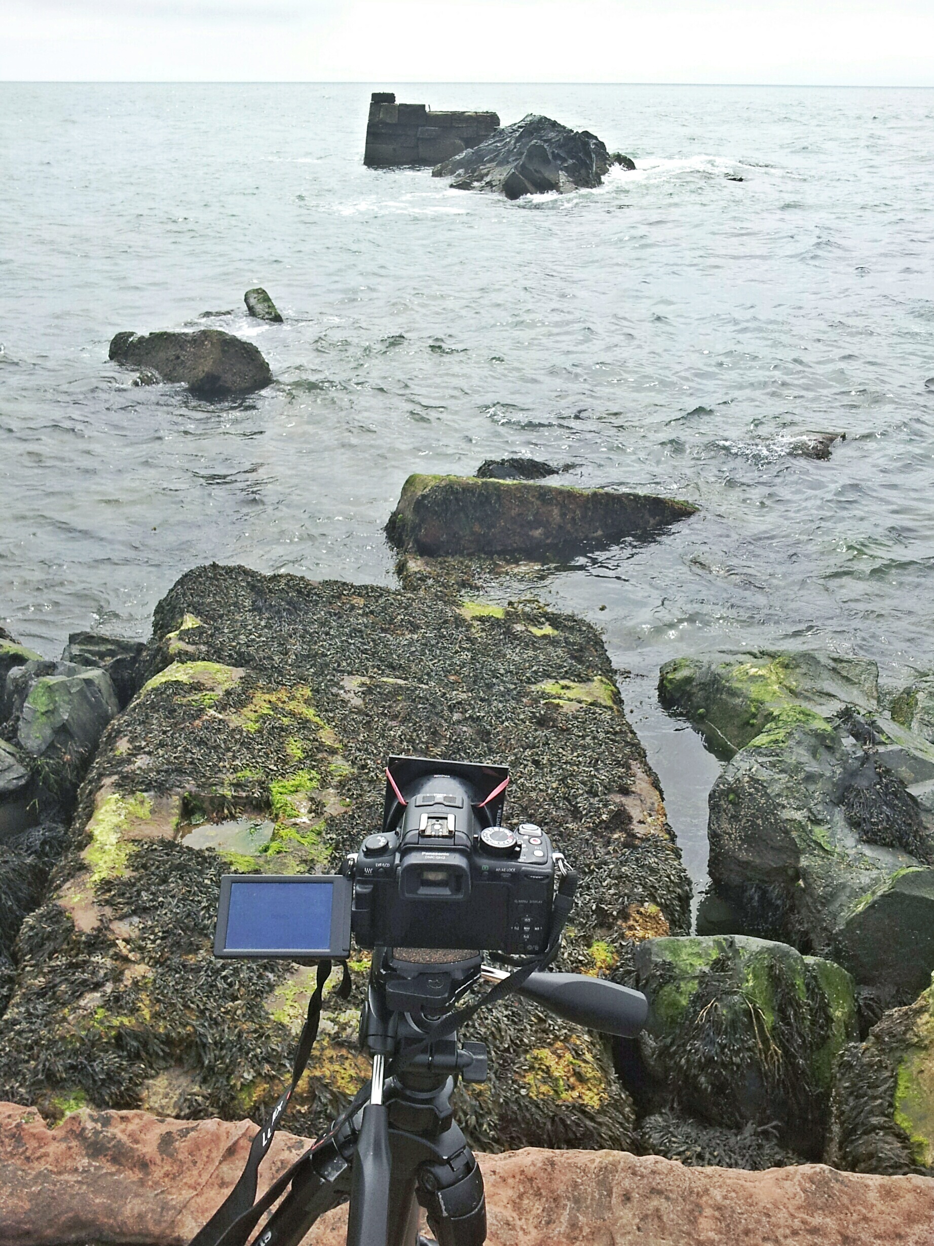
Decide which lenses, at which apertures, you want to profile. Make your own design, print it out at least A4 size, and affix it to a wall. We want the lighting to be as even as possible, so ideally use indoor artificial light after dark (ie this is a good project for a dark evening). Carefully, set up the camera on a tripod facing the chart square-on, and move close enough so the test-chart is just filling the frame.

Camera settings: use the lowest ISO setting possible (normally around 100), to minimize sensor noise. Use aperture-priority mode so it chooses the shutter-speed itself and fix the white-balance to counteract the indoor lighting. (For a daylight lightbulb, use daylight; otherwise, fluorescent or tungsten. Avoid auto-white-balance.)
Either use a remote-release cable or wireless trigger, or enable a 2-second self-timer mode to allow shaking to die down after pushing the shutter. Assuming the paper with the test-chart is still mostly white, use exposure-compensation (+2/3 EV).
For each lens and focal-length, start with the widest aperture and close-down by a third or half a stop, taking two photos at each aperture.
Open a small text-document and list each lens and focal-length in order as you go, along with any other salient features. (For example, with old manual prime lenses, note the start and final apertures and the interval size – may be half-stops, may be third of a stop.)
Use a RAW converter to process all the images identically: auto-exposure, fixed white-balance, and disable any sharpening, noise-reduction and rescaling you might ordinarily do. Output to 16-bit TIFF files.

Now, it is a given that a reasonable measure of pixel-level sharpness in an image, or part thereof, is its standard deviation. We can use the following Python script (requires numpy and OpenCV modules) to load image(s) and output the standard deviations of subsets of the images:

#!/usr/bin/env python

import sys, glob, cv, cv2
import numpy as np

def imageContrasts(fname):
  img = cv2.imread(fname, cv.CV_LOAD_IMAGE_GRAYSCALE)
  a=np.asarray(img)
  width=len(img[0])
  height=len(img[1])
  half=a[0:height//3, 0:width//3]
  corner=a[0:height//8, 0:width//8]
  return np.std(a), np.std(half), np.std(corner)

def main():
	files=sys.argv[1:]
	if len(files)==0:
		files=glob.glob("*.jpg")
	for f in files:
		co,cc,cf=imageContrasts(f)
		print "%s contrast %f %f %f" % (f, co, cc, cf)

if __name__=="__main__":
	main()

We can build a spreadsheet listing the files, their apertures and sharpnesses overall and in the corners, where vignetting typically occurs. We can easily make a CSV file by looping the above script and some exiftool magic across all the output TIFF files:

bash$ for f in *.tif
do
ap=$(exiftool $f |awk '/^Aperture/ {print $NF}' )
speed=$( exiftool $f |awk '/^Shutter Speed/ {print $NF}' )
conts=$(~/python/image-interpolation/image-sharpness-cv.py $f | sed 's/ /,/g')
echo $f,$ap,=$speed,$conts
done

Typical output might look like:

P1440770.tif,,=1/20,P1440770.tif,contrast,29.235214,29.918323,22.694936
P1440771.tif,,=1/20,P1440771.tif,contrast,29.253372,29.943765,22.739748
P1440772.tif,,=1/15,P1440772.tif,contrast,29.572350,30.566767,25.006098
P1440773.tif,,=1/15,P1440773.tif,contrast,29.513443,30.529055,24.942437

Note the extra `=’ signs; on opening this in LibreOffice Spreadsheet, the formulae will be evaluated and fractions converted to floating-point values in seconds instead. Remove the spurious `contrast’ column and add a header column (fname,aperture,speed,fname,overall,half,corner).

Analysis

Let’s draw some graphs. If you wish to stay with the spreadsheet, use a pivot table to average the half-image contrast values per aperture per lens and work off that. Alternatively, a bit of interactive R can lead to some very pretty graphs:

> install.package(ggplot2)
> library(ggplot2)
> data<-read.csv("sharpness.csv") 
> aggs<-aggregate(cbind(speed,entire,third,corner) ~lens+aperture, data, FUN=mean)
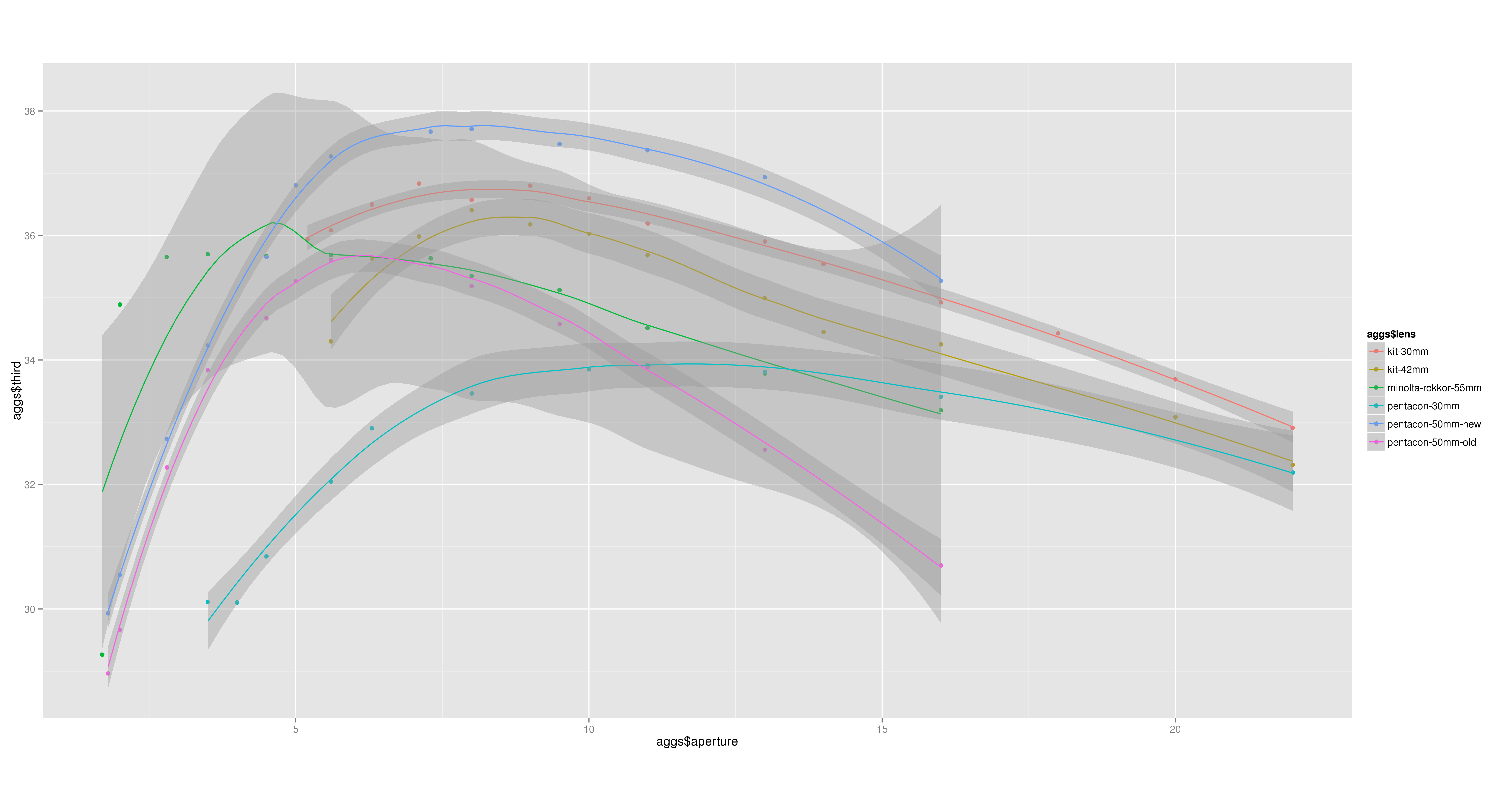
> qplot(aggs$aperture, aggs$third, col=aggs$lens, data=aggs, asp=.5)+geom_smooth()

This will give a comparison of overall sharpness by aperture, grouped by lens. Typically we expect every lens to have a sweetspot aperture at which it is sharpest; my own examples are no exception: third 
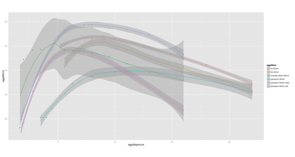
There are 5 lenses at play here: a kit 14-42mm zoom, measured at both 30mm and 42mm; a Minolta Rokkor 55mm prime; a Pentacon 30mm prime; and two Pentacon 50mm f/1.8 prime lenses, one brand new off eBay and one that’s been in the bag for 4 years.

The old Pentacon 50mm was sharpest at f/5.6 but is now the second-lowest at almost every aperture – we’ll come back to this. The new Pentacon 50mm is sharpest of all the lenses from f/5 onwards, peaking at around f/7.1. The kit zoom lens is obviously designed to be used around f/8; the Pentacon 30mm prime is ludicrously unsharp at all apertures – given a choice of kit zoom at 30mm or prime, it would have to be the unconventional choice every time. And the odd one out, the Rokkor 55mm, peaks at a mere f/4.

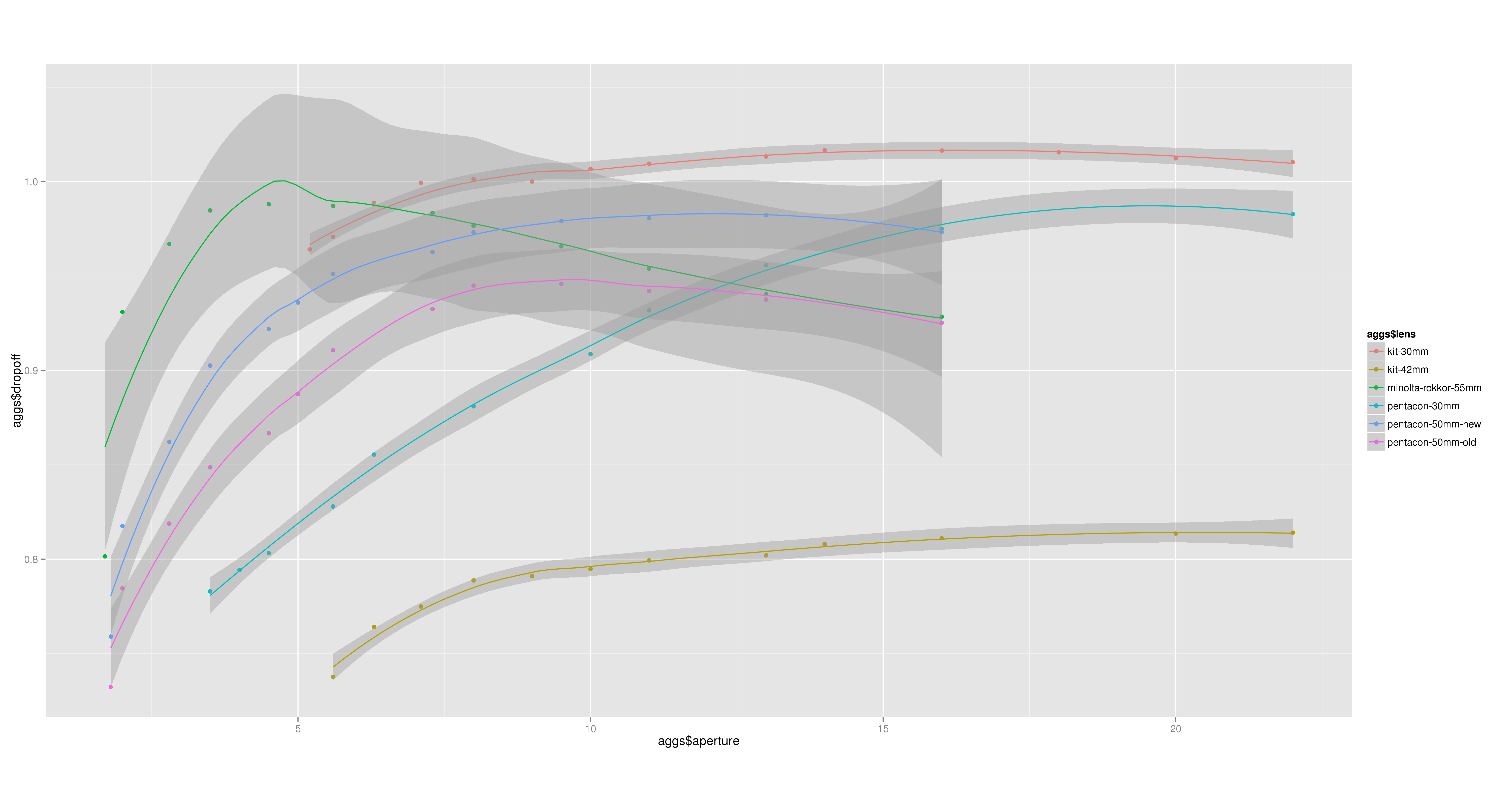
How about the drop-off, the factor by which the extreme corners are less sharp than the overall image? Again, a quick calculation and plot in R shows:

> aggs$dropoff < - aggs$corner / aggs$third
> qplot(aggs$aperture, aggs$dropoff, col=aggs$lens, data=aggs, asp=.5)+geom_smooth()

dropoff Some observations:

  • all the lenses show a similar pattern, worst vignetting at widest apertures, peaking somewhere in the middle and then attenuating slightly;
  • there is a drastic difference between the kit zoom lens at 30mm (among the best performances) and 42mm (the worst, by far);
  • the old Pentacon 50mm lens had best drop-off around f/8;
  • the new Pentacon 50mm has least drop-of at around f/11;
  • the Minolta Rokkor 55mm peaks at f/4 again.

So, why do the old and new Pentacon 50mm lenses differ so badly? Let’s conclude by examining the shutter-speeds; by allowing the camera to automate the exposure in aperture-priority mode, whilst keeping the scene and its illumination constant, we can plot a graph showing each lens’s transmission against aperture.

> qplot(aggs$aperture, log2(aggs$speed/min(aggs$speed)), col=aggs$lens, data=aggs, asp=.5)+geom_smooth()

speed 
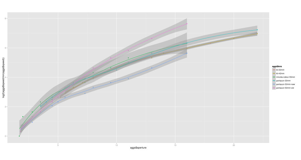
Here we see the new Pentacon 50mm lens seems to require the least increase in shutter-speed per stop aperture, while, above around f/7.1, the old Pentacon 50mm lens requires the greatest – rocketing off at a different gradient to everything else, such that by f/11 it’s fully 2 stops slower than its replacements.

There’s a reason for this: sadly, the anti-reflective coating is starting to come off in the centre of the front element of the old lens, in the form of a rough circle approximately 5mm diameter. At around f/10, the shutter iris itself is 5mm, so this artifact becomes a significant contributor to the overall exposure.

Conclusion

With the above data, informed choices can be made as to which lens and aperture suit particular scenes. When shooting a wide-angle landscape, I can use the kit zoom at f/8; for nature and woodland closeup work where the close-focussing distance allows, the Minolta Rokkor 55mm at f/4 is ideal.
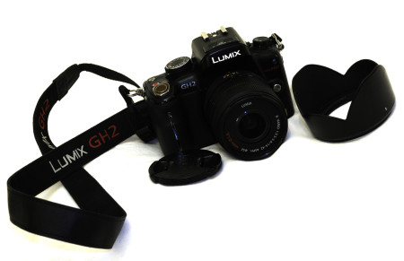
My Photography Zen just ran over your Dogma

In a previous life I used to attend the local photography club; there were ups (friends; winning the occasional competition; being involved, mostly in geekish matters; making the occasional presentation) and some noteworthy downs (a very rude judge; a feeling that photos were judged according to how “lucky” they were to have been found, rather than appreciating skill in the making). On the whole, however, they were welcoming and friendly and it was generally “my” club.

So, now we’ve settled elsewhere in the country, I thought I’d investigate the local camera club.

Such conversation as there was was mostly limited to willy-waving equipment:

  • someone’s selling their Canon 550D and someone else has a 7D. I don’t care; show me the results from either.
  • “oh yeah, oh yeah, Sigma’s a good make. I’ve got a Tokina 11-16mm lens, that’s quite wide-angle”. Immodest one-upmanship, as though one’s lens’s field of view is something to boast about.
  • “I don’t use Photoshop. I figure if you’ve spent thousands on a good camera…”. Well good for you; if I’d spent thousands on my camera I’d consider it imbalanced not to be matched in complexity of software.
  • “I don’t use Photoshop. It makes competitions unfair, that someone puts in the work to do it correctly in-camera and someone else takes a lousy photo and makes it good”. Wake up: post-processing is a necessary part of photography, and at least they’re getting results.
  • “So what do you use?” A Panasonic. “Oh.” Pause. “I have a Nikon” (points to bag emblazened with a Sony logo). I’m as glad for you as the results you get are good.
  • I bought a 100-400mm lens for £650; the chap selling it said it had auto-focus but I was disappointed when it didn’t”. Tough luck; my favourite lens cost me £40 on eBay.

It being the first night of the season, there was a short presentation of a selection of images (of varying degrees of appeal; “sorry but we haven’t calibrated the projector yet” – and it showed, as the red channel was completely blown) and an awful lot of laying-down rules about competitions (down to 2 photos per contributor per competition, inexplicably; a meagre 1024*768px size for digital submissions).

The arguments are old, tired and banal. There was no evidence of people being interested in each others’ choice of subject-matter or approaches to it – what makes them tick as photographers, people, artists. Like landscape or find it too anyone-can-appreciate-it common-denominator? Like portraiture? Sports? Abstract art, fine art? Microscopy?

As a parallel to the hardware fixation, all talk of software – including, critically, “advancing one’s photography” – centred on Adobe Photoshop, as though it were the only tool out there.

Nature:TNGTo state the obvious, photography is not about hardware – the clue’s in the name: light-writing; it’s about image – the image – and what thoughts it evokes in one’s brain. Advancement is a matter of choice, control (pushing the right buttons for desired outcomes) and knowledge – the practical experiences of requirements and attainability at time of shooting and of rationally choosing settings for their consequences as a function of the image-space (rather than as individual corrections or tweaks) in post-processing.

Nor is post-processing all about Photoshop either – but I know what saturation, high-pass sharpening, barrel-distortion-correction and channel-mixing do to an image, and I know how my particular camera behaves with noise arising from high ISO as distinct from longer exposures, and that I prefer to remove both kinds of the camera’s noise as much as possible only to reapply synthetic grain using a Perlin noise generator. All are functions of the image, independent of the software being used.

From experience, the best a competition can do is assign a score – subject to the judge’s biases – and, typically, make some superficial remarks about if one were to “…just tweak the sharpness a bit”… as though there were only one such control (I can think of simple, deconvolution, unsharp masking, high-pass, refocus and Wiener sharpening algorithms off the top of my head – which of these do they just mean?!). This does not lead to advancement.

I do not have to subscribe to their arbitrary rules, limitations and regulations.

I will not be attending that photo-club.

I have images to be making!

Welding Glass and Rubber Bands

Sometimes, one feels the need to make long-exposure photos (15s+) during daylight. One option is to buy a Lee Big Stopper, Hitech 100 ND1000 or other neutral-density filter, but these are far from cheap. Alternatively, one could stack a bunch of cheap ND filters on top of each other (ND8+ND4 etc), but then the image-quality suffers and there may be significant magenta colour tints. Further, as the degree of filtration increases, the necessity of preventing light-leaks around the edges of the filters also increases.

Enter the cheapskate: welding glass. According to my experiments, this stuff will pass a tiny fraction of the light from the scene, extending exposure time by 10-11 stops. Admittedly, it more than just tints the scene, it colours it a thick sludgy lurid green, seriously reducing the colour bit-depth in the red and blue channels. Further, it might not fit a regular filter holder.

Hence, a rather complicated shooting and processing methodology.

Perpetrating long exposures

Perpetrating long exposures, complete with rubber bands and welding glass.

When out in the field, if the lens-hood can be inverted, you can use rubber bands to hold the welding glass in place. First advantage: the filter is as close to the lens as it can be, so no light leaks.

Second, we shoot a panorama. In this case, the scene exposure varies with height in the intended finished scene; thus, we choose a vertorama where individual shots are taken in landscape orientation, working up from foreground rocks at the bottom (longer exposure times) to sky at the top, because this keeps the contrast-ratio low in each individual frame. In all, 16 images were shot whilst panning the tripod in the vertical axis, totalling 186 seconds of exposure time.

_1400156

A single source image showing the lurid welding-glass green “tint” and massive lens distortion.

These images were processed in Photivo, using one of my standard presets with corrected white-balance, minimal but adequate noise-reduction (Pyramid algorithm) and Wiener sharpening. Lens distortion, whilst acute, is not addressed at this stage.

Top tip: in scenes such as this, the water just below the far horizon is the closest to an average grey in the light, and makes a good reference for spotting white-balance.

Stitching is done in Hugin, where the considerable distortion from a cheap wide-angle kit zoom lens can be optimized out – the horizon line, bowed to varying degrees by angle of inclination, becomes straight almost by magic. Further, Hugin was set to blend the images using enfuse, which allows selecting pixels to favour both exposure and image entropy – this simply chooses the pixels closest to a midtone, constituting a simple natural HDR.

Second advantage: we’ve just solved lens vignetting as well, because the pixels that were in one image’s corners can be taken from mid-edge pixels in other images.

The output from Hugin’s panorama stitching is a realistic and natural reference image.

From there, it falls to the usual odyssey of post-processing, mostly using Darktable to chose the finished appearance: crop to square, a conversion to black and white (with 80% orange filter), high-pass sharpening and spatial contrast parameters (fourier-space) and a low-pass filter in multiply mode coupled with tonemapping to even-out the large-scale contrast whilst retaining lots of local detail, grad-ND filter applied to retain some contrast in the sky, etc.

At this point, let’s pause to consider the alternatives. Pick an amount of money: you can spend as much as you care to mention on a dSLR to get, maybe, 24 megapixels. What little you have left over can be spent on a sharp lens and a 10-stop ND filter. Now consider taking one image of 3 minutes’ exposure and processing it in some unmentionable popular proprietary processing software. First, the rotation to straighten the horizon and crop from 3:2 aspect-ratio to square are going to cost you about 35% of the pixels, so that 24 is down to 15 megapixels. Then performing noise-reduction is going to cost per pixel, ie the bit-depth is reduced by maybe 2 (on average) from 12 or 14 bits per pixel per channel. Further processing will remove hot and dead pixels. All this is before deciding to process for a particular appearance – we’re still working on a good reference image and the data is vanishing with every click of the mouse, and what little we’re left with is tainted by algorithmic approximation rather than originating with photons coming from the scene.

By performing the panorama routine, the equipment can be much cheaper: a 15-megapixel sensor with poor bit-depth and yet the archive processed image is 22.5 megapixels, all of them good, originating more from photons than approximation.

And it looks pretty good, too:

There Is No Boat.

There Is No Boat.

As an aside, a small boat sailed right around and through the scene while I was shooting the panorama. Because all of the images were fairly long, it left no noticeable impression on the resultant image at all.

[Some product links may be via the Amazon affiliate programme.]

Our Earth Was Once Green

A few months ago, when we moved into the area, one of the first local scenes I spotted was this view of beech trees along the brow of a small hill, running along the side of a fence, terminating with a gate and a hawthorn tree.

I managed to capture the view with the remnants of snow as the deeper drifts melted away:

Some Trees

Some Trees

and I wrote a previous article about what set that image apart from a quick mobile snap of the scene as well.

As a photographer, I was looking forward to capturing the scene in varying seasons – indeed, I could anticipate my output becoming repetitive and running out of inspiration for different ways to portray it.

I got as far as two variations.

First, The Answer: tall beech trees, covered in new foliage for the onset of summer, blowing in the wind:

the answer

The Answer

and then an evening portrait of summer skies with blue wispy cirrus clouds above the trees:

Some Sky

Some Sky

In the past week, the impressive beeches have been cut down; a drain pipe has been laid just this side of the trees, the fence is removed and the whole hillside has been ploughed so what used to be an expanse of green grass is currently brown soil. I guess at least that won’t last long before it recovers.

Our Earth Was Once Green

Our Earth Was Once Green

Yesterday evening I caught a TV programme about Scotland’s landscape, from the point of view of some awful Victorian book, a rather romantic tourist guide for “picturesque” views, the programme showing the contrast with tourists’ search for an “authentic experience” of Scotland – yet pointing out how, more or less by definition, to be a tourist is inevitably to be an uninvolved spectator.

One of the guests in the programme was a local photographer, who explained how landscape photographers struggle with the dichotomy of presenting the landscape as timeless, pure, untainted by human hand, whilst knowing in the back of their mind that they’re perpetrating a myth through selectivity, that the landscape is far from wild and natural – the deforestation dates back 8 millenia to pre-history, what now appears as Highland heather-clad grouse-moor heath used to be crofting land prior to the Clearances, etc.

While landscape used to be my chosen genre of photography, and a fair proportion of what I now shoot – including the above – still qualifies as such, I think it’s time to recognize that landscape photography is not just about the tourist photographer seeking ever-wilder ever-more-northern scenery, nice as that can be, but rather includes potentially less travel whilst valuably documenting the landscape changing from year to year, whether those changes arise from natural forces or human intervention.

Bird on a Wire

It had to be done:

"Bird on a Wire"

“Bird on a Wire”


A few days ago a contact on flickr observed I’d entitled a photo in a rather perfunctory fashion, `A Tree‘. The tree itself is relatively characterful, branches blown according to the prevailing wind direction into an exuberant tentacle-waving display; the work that went into the processing of that image was, as usual, significant: it’s a vertorama, the presets used for each image evolved for optimum image quality, the stitching took time, and a lot of time was spent choosing the filtering, black&white conversion and toning.

One thing I noticed about competitions in photography clubs is a distinct tendency for photos to be awarded higher marks according to the literality of their titles relative to their physical subject-matter. This was irksome at the time (as I’m currently “between clubs”), but on a little thought I’ve realised there are several styles of titling photos:

  • one layer of abstraction towards a concept: “dreich”
  • literal: “sparrow”, “buzzard”, “dandelion”
  • understated – perhaps textual / ideological minimalism parallel to the photographic aesthetic
  • cynical, throw-away or orthogonal (e.g. “Untitled” or using the camera’s sequence-numbered filename)
  • outright cliché

Some photos just fall straight into the latter category. No amount of grungy texture-blending processing is going to stop people seeing my photo of the day today and superstitiously muttering the incantation, “bird on a wire”; a Google image-search brings up an entire page full of similar images, differing mostly in the number of birds involved. Similarly, there’s something in the shared photographer psyche that instantly entitles any example of wabi-sabi as “seen better days”. Googling that is left as an exercise for the reader.

More to the point, if a photographer (or their editor) has sufficient lack of background story to entitle such a shot otherwise, should it have been taken except for the sake of adding to one’s collection?

I’m up to 7 birds on the wire now and they’ve changed into pigeons.

Selectivity, or Why is Good?

I remember two particular thoughts from my time in a photo-club (past-tense, as we’ve moved house since).

First, discussing landscape photography with another member, he said he used a large-format (5×4) camera and Fuji Velvia film “because it gets results that express how it felt to be there at the time”. To be quite honest, this put me off landscape – particularly large-format – because I realised the nonsense behind it: after all, if I can name half a dozen people who all shoot LF+Velvia then that conflicts with the unique individuality of a feeling. Face it, it’s just a trend. [0]

Second, a lingering suspicion from club competitions. I felt that the previous photo-club had a bias toward photos where the photographer “got lucky”, which prompted thoughts of rebellion – surely a photo should be marked according to the skill exhibited in its making?

So what is landscape photography? Is it right to just wander around the landscape, see what looks nice and point the camera in the right direction? Or is it desirable to spend hours poring over OS maps, Google Streetview and the MetOffice weather to plan a trip to a specific scene with particular favourable lighting and conditions?

By what criteria will the resultant photograph be regarded as “good” – that it conforms to some guidelines of composition, that it tells a human-interest story, or that it merely represents what it looked like to be in a given place and time?

This pair of images serves as an example.

I like it, as a reminder of walking the dog here every day (my story!), but it would be fair to say it was little more than an illustrative snap – the lighting is sub-optimal, the tonality is crass, the image-quality is fairly poor (as befits an image taken on a mobile phone), and above all, it’s cluttered with many elements as the road and wind-turbine introduce whole new themes of mankind’s interactions with nature.

But a couple of weeks ago, I made a photo Some Trees from nearly the same viewpoint:

And this is favourably regarded in photographic circles. The difference is selectivity: by choosing a tighter framing (both at the scene and only a slight crop in post-processing), I’ve avoided the road and wind turbine, concentrating on the wind-blown trees plodding like Atlas up the outline of the hill and the remaining vestiges of snow. Of course, by also removing the colour in favour of plain black and white, I’ve made the silhouette more stark and concentrated on shapes and lines and form rather than realism.

But the snap is still true to life. Maybe there’s room for saying landscape photography should be both about the photography (which introduces the detached external off-line phenomena during the stages of image-construction and criticism) but also about the landscape, which one should simply appreciate for how it really looks without being excessively selective?


[0] The other member left the club soon after, but returned for just one evening a couple of years later, where we had quite a cathartic chat: I was returning to landscape on my own terms, and he was now shooting sports digitally elsewhere in the country. And the wheel turns…