ShinyPhoto: New Website

The old ShinyPhoto website was getting a bit long in the tooth. It saw several versions of Python come and go and increasingly suffered from bitrot. (Notably, a mutual incompatibility in the CGI module between python versions; it ran for so long the backend storage engine I used became deprecated with no easy way out but to revert to one I wrote myself – not a good reason to rely on third-party libraries!)

So, for the past couple of months I’ve been learning my way around Javascript and node.js and have replaced the site with a new gallery to show-off my photos.

Being me, it’s a bit geeky. With web-design there are so many angles to consider, but here are a few aspects that stick in the mind:

Technical: no XSLT; this is the first time in nearly 20 years where I’ve used a different templating language – in this case, Mustache since it does need to be able to produce non-HTML data as well.

Learning: there’s a whole ecosystem of node.js packages (NPMs) that have come in handy, from the Express webserver to image-resizing utilities (some of which are faster than others!).

Data: in my more professional work capacity I deal with data-storage on a daily basis, so it has some passing interest. One of the problems with the old site was its inability to extract metadata from images; because this instance’s primary focus is the organization and display of photos, I decided that the JPEG should contain all the data displayed – title, description, geotagging, keywords all extracted from one upload and the less manual editing effort required, the better. Essentially, digiKam is both organizer and implicit website editor on my desktop.

Database: with the unit of data being the JPEG, presented as a page per photo, that maps well into a document-oriented model such as one of the NoSQL JSON-based databases. Unfortunately MongoDB disgraced themselves by choosing a non-open-source licence recently, so I was pleased to discover CouchDB – a modular system sharing protocols (JSON-over-HTTP(S)) and query language (MangoDB) across different storage backends with the advantage that I can start from the PouchDB pure node.js implementation but switch to an external version of the same with a quick data-replication later if need be. So far, it’s coping fine with 1.1GB of JPEG data (stored internally as attachments) and 70MB of log data.

Configurability: several aspects of the site are configurable, from the internal and external navigation menus to the cache-validity/timeout on images.

Scalable: my initial thought was to keep image-resizing pure-javascript and rely on nginx caching for speed; however, that would lose the ability to count JPEG impressions (especially thumbnails), so I switched to a mixed JS/C NPM and now resizing is sufficiently fast to run live. The actual node.js code itself also runs cleanly – feels very snappy in the browser after the old python implementation.

Metadata/SEO: the change of templating engine has meant specific templates can be applied to specific kinds of pages, rather than imposing one structure across the whole site; different OpenGraph and Twitter-Card metadata applies on the homepage, gallery and individual photo pages.

Statistics: lots of statistics. There are at least three aspects where statistics rule:

  • the usual analytics; it’s always handy to keep an eye on the most-popular images, external referrers, etc. The site uses its own application-level logging to register events on the page-impression scale, so the log data is queryable without having to dig through CLF webserver logs.
  • how should a photo gallery be sorted? By popularity, by date? Do thumbnails count? What about click-through rate? The new site combines all three metrics to devise its own score-function which is recalculated across all images nightly and forms the basis of a display order. (It surprises me that there are photo-galleries that expect people to choose the sort order by hand, or even present no obvious order at all.)
  • how should a photo-gallery be organized? My work is very varied, from bright colour to black and white, from sky to tree to mountain and water, from fast to long exposure, from one corner of the country to another, as the landscape leads; I did not want to impose a structure only to have to maintain it down the line. Accordingly, the new ShinyPhoto is self-organizing: within any slice through the gallery, a set of navigation tags is chosen that splits the images closest to half. Relatedly, the images on the homepage used to be a static selection, manually edited; now they are chosen dynamically by aspect-ratio and score.
  • Marketing: some aspects of the layout now enjoy a/b testing – no cookies required, but another hash function determines the site appearance and I can check which work best over time.

So far, it’s proving pleasantly easy to live with; apart from the continual debugging and adding of new features – fortunately now slowing down – I’m adding photos at a rate of a handful a day both to the site and to a new RedBubble account in case anyone wants to buy them, one way or another.

So apparently I now like the whole node.js ecosystem. It’s blown away the cobwebs of running – or more accurately not-running – a legacy website, whilst retaining full control of the appearance and structure of the site not handing that over to some third-party site designer.

A good way to start a new year, methinks.
Knowing Your Lenses

Analysing Lens Performance

Background

Typically, when a manufacturer produces new lenses, they include an MTF chart to demonstrate the lens’s performance – sharpness measured as the number of line-pairs per millimetre it can resolve (to a given contrast tolerance), radially and sagitally, varying with distance from the centre of the image. While this might be useful before purchasing a lens, it does not make for easy comparisons (what if another manufacturer uses a different contrast tolerance?) nor does it necessarily well reflect the use to which it’ll be put in practice. (What if they quote a zoom’s performance at 28mm and 70mm f/5.6, but you shoot it most at 35mm f/8? Is the difference between radial and sagittal sharpness useful for a real-world scene?)
Further, if your lens has been around in the kit-bag a bit, is its performance still up to scratch or has it gone soft, with internal elements slightly out of alignment? When you’re out in the field, does it matter whether you use 50mm in the middle of a zoom or a fixed focal-length prime 50mm instead?
If you’re shooting landscape, would it be better to hand-hold at f/5.6 or stop-down to f/16 for depth of field, use a tripod and risk losing sharpness to diffraction?
Does that blob of dust on the front element really make a difference?
How bad is the vignetting when used wide-open?

Here’s a fairly quick experiment to measure and compare lenses’ performance by aperture, two ways. First, we design a test-chart. It’s most useful if the pattern is even across the frame, reflecting a mixture of scales of detail – thick and thin lines – at a variety of angles – at least perpendicular and maybe crazy pseudo-random designs. Here’s a couple of ideas:

Method

Decide which lenses, at which apertures, you want to profile. Make your own design, print it out at least A4 size, and affix it to a wall. We want the lighting to be as even as possible, so ideally use indoor artificial light after dark (ie this is a good project for a dark evening). Carefully, set up the camera on a tripod facing the chart square-on, and move close enough so the test-chart is just filling the frame.

Camera settings: use the lowest ISO setting possible (normally around 100), to minimize sensor noise. Use aperture-priority mode so it chooses the shutter-speed itself and fix the white-balance to counteract the indoor lighting. (For a daylight lightbulb, use daylight; otherwise, fluorescent or tungsten. Avoid auto-white-balance.)
Either use a remote-release cable or wireless trigger, or enable a 2-second self-timer mode to allow shaking to die down after pushing the shutter. Assuming the paper with the test-chart is still mostly white, use exposure-compensation (+2/3 EV).
For each lens and focal-length, start with the widest aperture and close-down by a third or half a stop, taking two photos at each aperture.
Open a small text-document and list each lens and focal-length in order as you go, along with any other salient features. (For example, with old manual prime lenses, note the start and final apertures and the interval size – may be half-stops, may be third of a stop.)
Use a RAW converter to process all the images identically: auto-exposure, fixed white-balance, and disable any sharpening, noise-reduction and rescaling you might ordinarily do. Output to 16-bit TIFF files.

Now, it is a given that a reasonable measure of pixel-level sharpness in an image, or part thereof, is its standard deviation. We can use the following Python script (requires numpy and OpenCV modules) to load image(s) and output the standard deviations of subsets of the images:

#!/usr/bin/env python

import sys, glob, cv, cv2
import numpy as np

def imageContrasts(fname):
  img = cv2.imread(fname, cv.CV_LOAD_IMAGE_GRAYSCALE)
  a=np.asarray(img)
  width=len(img[0])
  height=len(img[1])
  half=a[0:height//3, 0:width//3]
  corner=a[0:height//8, 0:width//8]
  return np.std(a), np.std(half), np.std(corner)

def main():
	files=sys.argv[1:]
	if len(files)==0:
		files=glob.glob("*.jpg")
	for f in files:
		co,cc,cf=imageContrasts(f)
		print "%s contrast %f %f %f" % (f, co, cc, cf)

if __name__=="__main__":
	main()

We can build a spreadsheet listing the files, their apertures and sharpnesses overall and in the corners, where vignetting typically occurs. We can easily make a CSV file by looping the above script and some exiftool magic across all the output TIFF files:

bash$ for f in *.tif
do
ap=$(exiftool $f |awk '/^Aperture/ {print $NF}' )
speed=$( exiftool $f |awk '/^Shutter Speed/ {print $NF}' )
conts=$(~/python/image-interpolation/image-sharpness-cv.py $f | sed 's/ /,/g')
echo $f,$ap,=$speed,$conts
done

Typical output might look like:

P1440770.tif,,=1/20,P1440770.tif,contrast,29.235214,29.918323,22.694936
P1440771.tif,,=1/20,P1440771.tif,contrast,29.253372,29.943765,22.739748
P1440772.tif,,=1/15,P1440772.tif,contrast,29.572350,30.566767,25.006098
P1440773.tif,,=1/15,P1440773.tif,contrast,29.513443,30.529055,24.942437

Note the extra `=’ signs; on opening this in LibreOffice Spreadsheet, the formulae will be evaluated and fractions converted to floating-point values in seconds instead. Remove the spurious `contrast’ column and add a header column (fname,aperture,speed,fname,overall,half,corner).

Analysis

Let’s draw some graphs. If you wish to stay with the spreadsheet, use a pivot table to average the half-image contrast values per aperture per lens and work off that. Alternatively, a bit of interactive R can lead to some very pretty graphs:

> install.package(ggplot2)
> library(ggplot2)
> data<-read.csv("sharpness.csv") 
> aggs<-aggregate(cbind(speed,entire,third,corner) ~lens+aperture, data, FUN=mean)
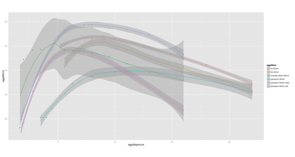
> qplot(aggs$aperture, aggs$third, col=aggs$lens, data=aggs, asp=.5)+geom_smooth()

This will give a comparison of overall sharpness by aperture, grouped by lens. Typically we expect every lens to have a sweetspot aperture at which it is sharpest; my own examples are no exception: third There are 5 lenses at play here: a kit 14-42mm zoom, measured at both 30mm and 42mm; a Minolta Rokkor 55mm prime; a Pentacon 30mm prime; and two Pentacon 50mm f/1.8 prime lenses, one brand new off eBay and one that’s been in the bag for 4 years.

The old Pentacon 50mm was sharpest at f/5.6 but is now the second-lowest at almost every aperture – we’ll come back to this. The new Pentacon 50mm is sharpest of all the lenses from f/5 onwards, peaking at around f/7.1. The kit zoom lens is obviously designed to be used around f/8; the Pentacon 30mm prime is ludicrously unsharp at all apertures – given a choice of kit zoom at 30mm or prime, it would have to be the unconventional choice every time. And the odd one out, the Rokkor 55mm, peaks at a mere f/4.

How about the drop-off, the factor by which the extreme corners are less sharp than the overall image? Again, a quick calculation and plot in R shows:

> aggs$dropoff < - aggs$corner / aggs$third
> qplot(aggs$aperture, aggs$dropoff, col=aggs$lens, data=aggs, asp=.5)+geom_smooth()

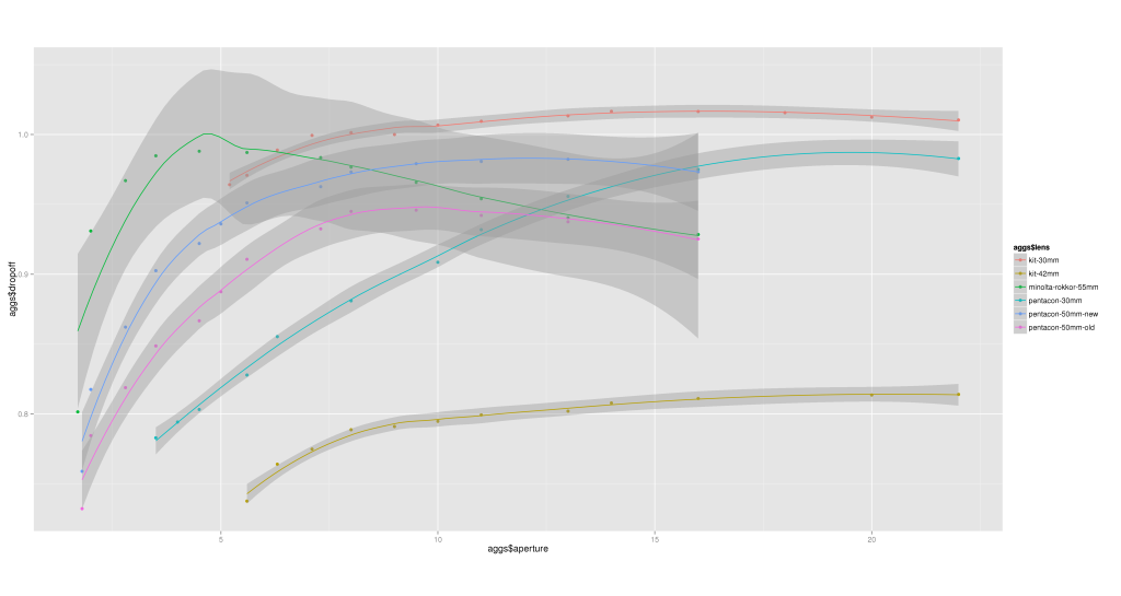
dropoff Some observations:

  • all the lenses show a similar pattern, worst vignetting at widest apertures, peaking somewhere in the middle and then attenuating slightly;
  • there is a drastic difference between the kit zoom lens at 30mm (among the best performances) and 42mm (the worst, by far);
  • the old Pentacon 50mm lens had best drop-off around f/8;
  • the new Pentacon 50mm has least drop-of at around f/11;
  • the Minolta Rokkor 55mm peaks at f/4 again.

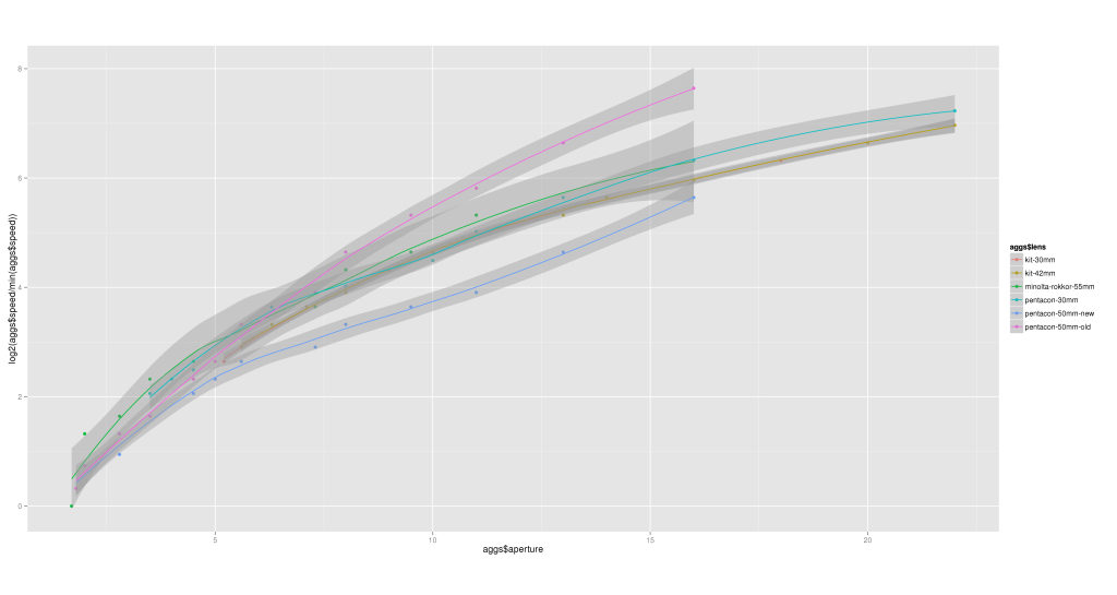
So, why do the old and new Pentacon 50mm lenses differ so badly? Let’s conclude by examining the shutter-speeds; by allowing the camera to automate the exposure in aperture-priority mode, whilst keeping the scene and its illumination constant, we can plot a graph showing each lens’s transmission against aperture.

> qplot(aggs$aperture, log2(aggs$speed/min(aggs$speed)), col=aggs$lens, data=aggs, asp=.5)+geom_smooth()

speed Here we see the new Pentacon 50mm lens seems to require the least increase in shutter-speed per stop aperture, while, above around f/7.1, the old Pentacon 50mm lens requires the greatest – rocketing off at a different gradient to everything else, such that by f/11 it’s fully 2 stops slower than its replacements.

There’s a reason for this: sadly, the anti-reflective coating is starting to come off in the centre of the front element of the old lens, in the form of a rough circle approximately 5mm diameter. At around f/10, the shutter iris itself is 5mm, so this artifact becomes a significant contributor to the overall exposure.

Conclusion

With the above data, informed choices can be made as to which lens and aperture suit particular scenes. When shooting a wide-angle landscape, I can use the kit zoom at f/8; for nature and woodland closeup work where the close-focussing distance allows, the Minolta Rokkor 55mm at f/4 is ideal.

Comparing MP3, Ogg and AAC audio encoding formats

Over the past couple of months, I’ve been both learning the R language and boosting my understanding of statistics, the one feeding off the other. To aid the learning process, I set myself a project, to answer the age-old question: which lossy audio format is best for encoding my music collection? Does it matter if I use Ogg (oggenc), MP3 (lame) or AAC (faac), and if so, what bitrate should I use? Is there any significance in the common formats such as mp3 at 128 or 192kbit/s?

First, a disclaimer: when it comes to assessing the accuracy of encoding formats, there are three ways to do it: you can listen to the differences, you can see them, or you can count them. This experiment aims to be objective through a brute-force test, given the constraints of my CD library. Therefore headphones, ears , speakers and fallible human senses do not feature in this – we’re into counting statistical differences, regardless of the nature of the effect they have on the listening experience. It is assumed that the uncompressed audio waveform as ripped from CD expresses the authoritative intent of its artists and sound engineers – and their equipment is more expensive than mine. For the purposes of this test, what matters is to analyze how closely the results of encoding and decoding compare with the original uncompressed wave.

I chose a simple metric to measure this: the root-mean-square (RMS) difference between corresponding samples as a measure of the distance between the original and processed waves. Small values are better – the processed wave is a more faithful reproduction the closer the RMSD is to zero. The primary aim is to get a feel for how the RMSD varies with bitrate and encoding format.

For a representative sample, I started with the Soundcheck CD – 92 tracks, consisting of a mixture of precisely controlled audio tests and some sound-effects and samples, augmented further with a mixture of a small number of CDs of my own – some rock (Queen, Runrig) and classical (Dvorak, Bach and Beethoven).

On the way, I encountered a few surprises, starting with this:

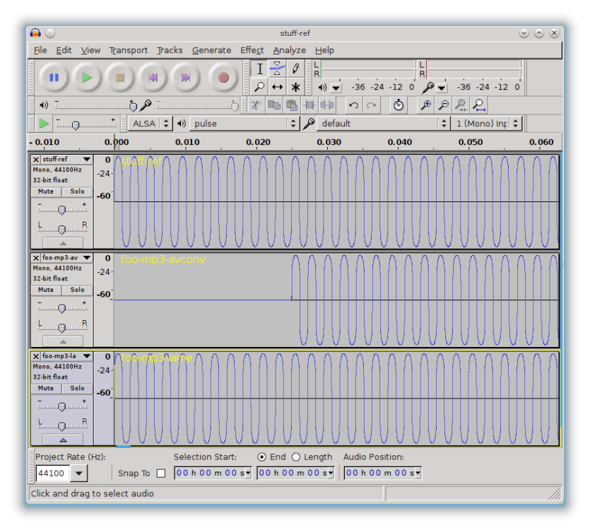
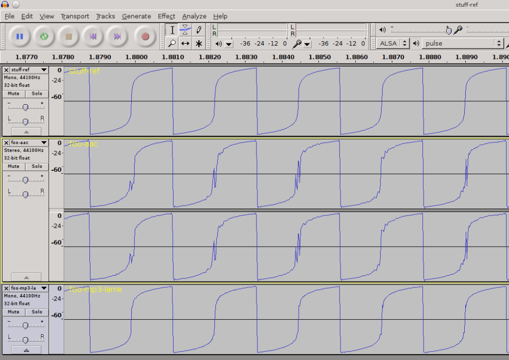
Errors using avconv to decode mp3

Errors using avconv to decode mp3

Initially I was using Arch Linux, where sox is compiled with the ability to decode mp3 straight to wav. The problem being: it prepends approximately 1300 zero samples at the start of the output (and slightly distorts the start). Using avconv instead had no such problem. I then switched to Ubuntu Linux, where the opposite problem occurs: sox is compiled without support for mp3, and instead it’s avconv that inserts the zero samples as the above screenshot of Audacity shows. Therefore, I settled on using lame both to encode and decode.

One pleasant surprise, however: loading wav files into R just requires two commands:

install.packages("audio")
library("audio")

and then the function load.wave(filename) will load a file straight into a (long) vector, normalized into the range [-1,1]. What could be easier?

At this point, interested readers might wish to see the sources used: R audio encoding comparison. I used a zsh script to iterate over bitrates, varying the commands used for each format; a further script iterates over files in other subdirectories as well. R scripts were used for calculating the RMSD between two wavs and for performing statistical analysis.

To complicate matters further, lame, the mp3 encoder, offers several algorithms to choose between: straightforward variable-bitrate encoding, optionally with a “-h” switch to enable higher quality, optionally with a lower bound “-b”, or alternatively, constant bitrate. Further, faac, the AAC encoder, offers a quality control (“-q”).

The formats and commands used to generate them are as follows:

AAC-100 faac -q 100 -b $i -o foo.aac “$src” 2
AAC-80 faac -q 80 -b $i -o foo.aac “$src” 2
mp3hu lame –quiet –abr $i -b 100 -h “$src” foo.mp3
mp3h lame –quiet –abr $i -h “$src” foo.mp3
mp3 lame –quiet –abr $i “$src” foo.mp3
mp3-cbr lame –quiet –cbr -b $i “$src” foo.mp3
ogg oggenc –quiet -b $i “$src” -o foo.ogg

As a measure of the size of the experiment: 150 tracks were encoded to Ogg, all four variants of MP3 and AAC at bitrates varying from 32 to 320kbit/s in steps of 5kbps.

The distribution of genres reflected in the sample size is as follows:

Genre number of tracks
Noise (pink noise with variations) 5
Technical 63
Instrumental 20
Vocal 2
Classical 39
Rock 21

Final totals: 30450 encode+decode operations taking approximately 40 hours to run.

The Analysis

Reassuringly, a quick regression test shows that the RMSD (“deltas”) column is significantly dependent on both bitrate, mp3 and ogg:

> fit<-lm(deltas ~ bitrate+format, d) > summary(fit)

Call:
lm(formula = deltas ~ bitrate + format, data = d)

Residuals:
     Min       1Q   Median       3Q      Max 
-0.06063 -0.02531 -0.00685  0.01225  0.49041 

Coefficients:
                Estimate Std. Error t value Pr(>|t|)    
(Intercept)    6.348e-02  8.663e-04  73.274  < 2e-16 ***
bitrate       -3.048e-04  3.091e-06 -98.601  < 2e-16 ***
formatAAC-80  -9.696e-16  9.674e-04   0.000 1.000000    
formatmp3      2.331e-02  9.674e-04  24.091  < 2e-16 ***
formatmp3-cbr  2.325e-02  9.674e-04  24.034  < 2e-16 ***
formatmp3h     2.353e-02  9.674e-04  24.324  < 2e-16 ***
formatmp3hu    2.353e-02  9.674e-04  24.325  < 2e-16 ***
formatogg      3.690e-03  9.676e-04   3.814 0.000137 ***
---
Signif. codes:  0 ‘***’ 0.001 ‘**’ 0.01 ‘*’ 0.05 ‘.’ 0.1 ‘ ’ 1 

Residual standard error: 0.04512 on 30438 degrees of freedom
  (4 observations deleted due to missingness)
Multiple R-squared: 0.275,      Adjusted R-squared: 0.2748 
F-statistic:  1649 on 7 and 30438 DF,  p-value: < 2.2e-16

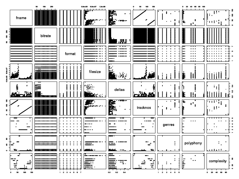
Note that, for the most part, the low p-values indicate a strong dependence of RMSD (“deltas”) on bitrate and format; we’ll address the AAC rows in a minute. Comparing correlations (with the cor function) shows:

Contributing factors - deltas:
    trackno     bitrate      format       genre   complexity
0.123461675 0.481264066 0.078584139 0.056769403  0.007699271

The genre and complexity columns are added by hand by lookup against a hand-coded CSV spreadsheet; the genre is useful but complexity was mostly a guess and will not be pursued further.

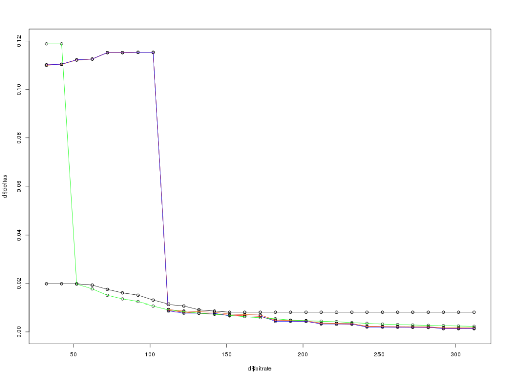
In the subsequent graphs, the lines are coloured by format as follows:

  • green – ogg
  • black – AAC
  • red – mp3 (ordinary VBR)
  • purple – mp3 (VBR with -h)
  • orange – mp3 (VBR with -b 100 lower bound)
  • blue – mp3 (CBR)

A complete overview:

Encoding errors, overview

Encoding errors, overview

Already we can see two surprises:

  • some drastic behaviour at low bitrates: up to 50kbit/s, ogg is hopelessly inaccurate; mp3 persists, actually getting worse, until 100kbit/s.
  • There is no purple line; the mp3 encoded with lame‘s -h switch is indistinguishable from vanilla mp3.
  • There is only one black line, showing the faac AAC encoder ignores the quality setting (80 or 100% – both are superimposed) and appears to constrains the bitrate to a maximum of 150kbps, outputting identical files regardless of the rate requested above that limit.

On the strength of these observations, further analysis concentrates on higher bitrates above 100kbit/s only, the AAC format is dropped entirely and mp3h is ignored.

This changes the statistics significantly. Aggregating the average RMSD (deltas) by genre for all bitrates and formats, with the entire data-set we see:

Aggregates by genre:
           genre       deltas
1        0-Noise  0.016521056
2    1-Technical  0.012121707
3 2-Instrumental  0.009528249
4        3-Voice  0.009226851
5    4-Classical  0.011838209
6         5-Rock  0.017322585

While when only considering higher bitrates, the same average deltas are now drastically reduced:

Aggregates by genre - high-bitrate:
           genre       deltas
1        0-Noise  0.006603641
2    1-Technical  0.003645403
3 2-Instrumental  0.003438490
4        3-Voice  0.005419467
5    4-Classical  0.004444285
6         5-Rock  0.007251133

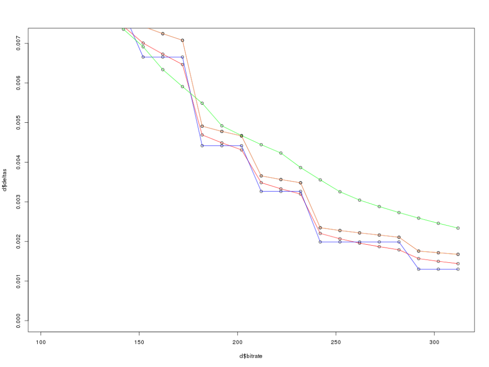
The high-bitrate end of the graph, coupled with the blend of genres, represents the likeliest real-world uses. Zooming in:

Encoding errors, high bitrate only

Encoding errors, high bitrate only

Reassuringly, for each format the general trend is definitely downwards. However, a few further observations await:

  • Ogg is the smoothest curve, but above about 180kbit/s, is left behind by all the variants of mp3.
  • The orange line (mp3, VBR with a lower bound of 100kbit/s) was introduced because of the performance at the low-bitrate end of the graph. Unexpectedly, this consistently performs worse than straightforward mp3 with VBR including lower bitrates.
  • All the mp3 lines exhibit steps where a few points have a shallow gradient followed by a larger jump to the next. We would need to examine the mp3 algorithm itself to try to understand why.

Deductions

Two frequently encountered bitrates in the wild are 128 and 192kbit/s. Comparing the mean RMSDs at these rates and for all bitrates above 100kbit/s, we see:

   format   deltas(128)  deltas(192)  deltas(hbr)
1 AAC-100  0.009242665   0.008223191  0.006214152
2  AAC-80  0.009242665   0.008223191  0.006214152
3     mp3  0.007813217   0.004489050  0.003357357
4 mp3-cbr  0.007791626   0.004417602  0.003281961
5    mp3h  0.008454780   0.004778378  0.003643497
6   mp3hu  0.008454780   0.004778408  0.003643697
7     ogg  0.007822895   0.004919718  0.003648990

And the conclusion is: at 128 and 192kbps and on average across all higher bitrates, MP3 with constant bitrate encoding is the most accurate.

Should I use it?

The above test of accuracy is only one consideration in one’s choice of data format. Other considerations include the openness of the Ogg format versus patent-encumbrance of mp3 and the degree to which your devices support each format. Note also that the accuracy of mp3-cbr at about 200kbps can be equalled with ogg at about 250kbps if you wish.

Correlations between all combinations of factors

Correlations between all combinations of factors

Returning to the disclaimer above: we have reduced the concept of a difference between two waveforms to a single number, the RMSD. To put this number in context, this plot of the waveforms illustrates the scope of errors encountered:

visualizing encoding differences

visualizing encoding differences

(Reference wave on top; AAC in the middle showing huge distortion and MP3 on the bottom, showing slight differences.)

This demonstrates why tests based on listening are fallible: the errors will definitely manifest themselves as a different profile in a frequency histogram. When listening to the AAC version, the sound heard is modulated by the product of both residual errors from encoding and the frequency response curve of the headphones or speakers used. Coupled with this, the human ear is not listening for accuracy to a waveform so much as for an enjoyable experience overall – so some kinds of errors might be regarded as pleasurable, mistakenly.

There are be other metrics than RMSD by which the string-distance between source and processed waveforms can be measured. Changing the measuring algorithm is left as an exercise for the reader.

Feel free to download the full results for yourself – beware, the CSV spreadsheet is over 30k rows long.