It was one of those crazy late-spring days with a clear divide in the weather – everywhere north of the highland boundary fault was meant to get extreme precipitation, while Fife and Angus remained cool and dry. So we walked for a while in the West Woods of Ethie, admiring the lines and shapes of tall beech trees and subtle light and shade under the canopy.
Tag Archives: intimate landscape
In Glen Nant
One of my favoured locations for a quick hour’s stroll in Argyll is Glen Nant, south of the village of Taynuilt; in particular the Ant Trail which leads you through a small Caledonian forest – not very reserved as many of the trees were felled a couple of centuries ago to fire the furnaces at Bonawe, but it seems folks have repented a bit since then.
Herewith, some more back-to-earth simple landscapes: Ben Cruachan from Glen Nant and a couple of intimate landscape studies.
Winter along the Provost’s Walk
This is fast becoming one of my favourite walks around town – not least because it’s less muddy than the other track out the back. Yesterday I awoke to find the world had turned white, complete with snow-drift piled-up on the front lawn by a passing snowplough. Naturally, over-inflated reports of traffic confusion abounded, although by the time I had to drive anywhere in the evening, the roads were as clear as a bell.
Anyway. I like this path. The Ruthven Water makes a great spot for the Doglet to paddle. All very relaxing and shiny in the white snow.
This is what it’s like around here…
Provost’s Walk:
Arty photos:
All shots taken on the Pentax K-1 using my new hand-held HDR workflow.
Birnam Hill: Details
A handful more photos from an afternoon stroll around Birnam Hill – little things that caught my eye. There was a small burn flowing down one of the paths, mostly covered in amazing semi-fractured ice crystals; patterns abound.
Colour or Black and White?
No doubt this is one of the oldest conundrums, generally long-since answered. The conventional approach is that black&white is meant to be an end in itself (a choice made at the time of shooting rather than an option or fallback in processing), in order that the eye be drawn to forms and shapes and textures, appreciated for their own sake without the distractions of realistic colour. As such, you’d expect most images to work either as black&white or as colour; it can also be somewhat annoying when one sees an image presented in more than one way as though the photographer couldn’t decide. It’s even more irksome when you are that photographer. Today I reprocessed an image taken a couple of months ago, and was struck by how it looked in the intermediate colour form before applying the intended toning.
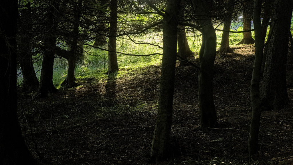
Shapes in the Dark – colour
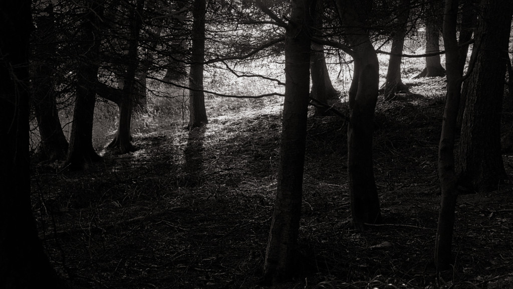
Shapes in the Dark – black and white
In this case, I contend the two images both stand alone independently well, and they convey different things; further, the the colour gives a means of distinguishing the silhouetted trees from the surrounding foliage that the black&white image does not, making it look moodier.