Photo-Walk 2017

For several years, on and off, I’ve attended an annual Photo-Walk based in Inverary, Argyll. This year was no exception – always good to catch up with friends I’ve met on the walk previously.

As always, Argyll is a favoured place and Autumn a favoured season; the combination of light and landscape makes for enjoyable drives.

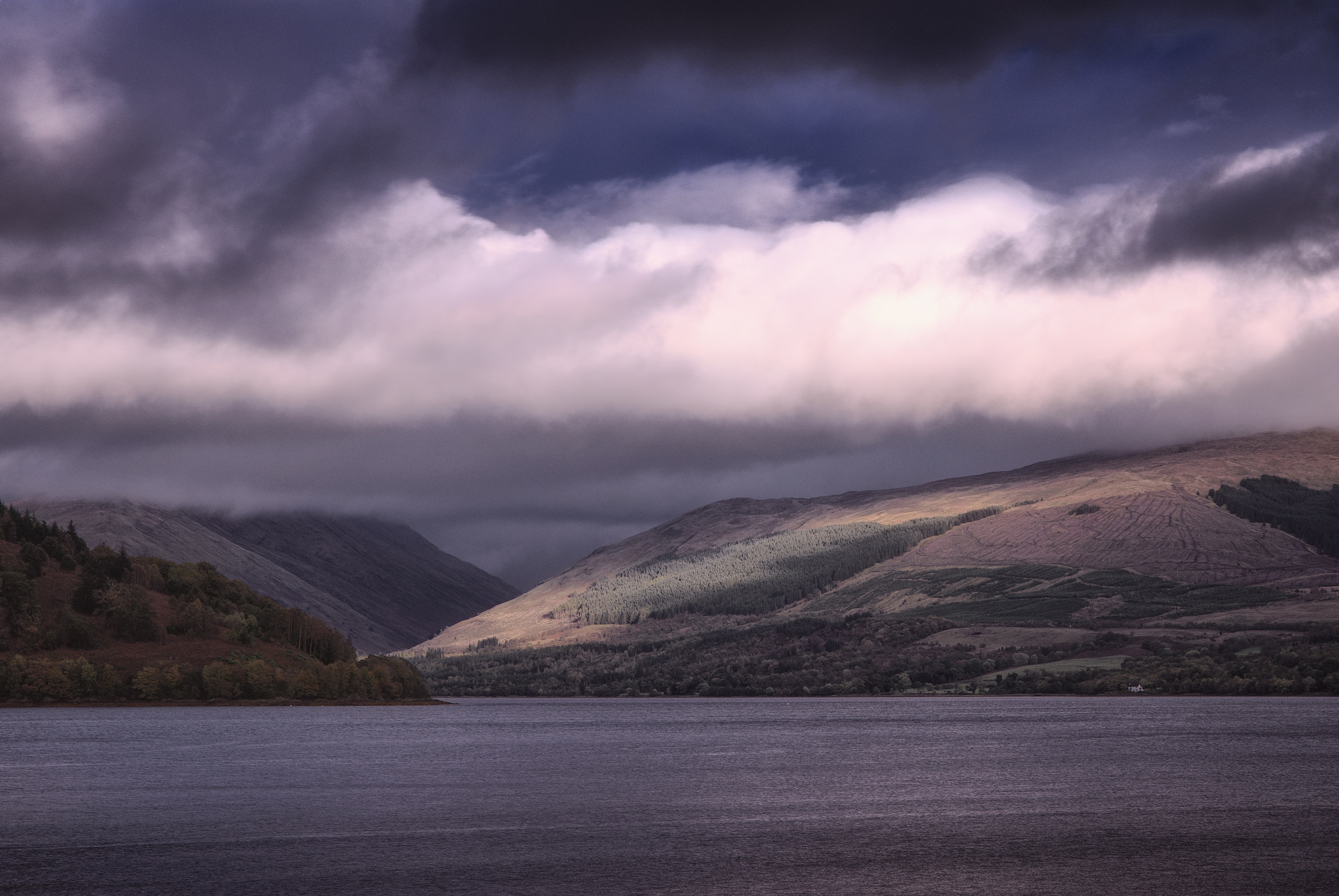
An auspicious viewpoint – right next to the public toilets on Inverary front – but it makes for a cracking view up the loch toward a spot of sunlight illuminating the hills around Ardkinglas.

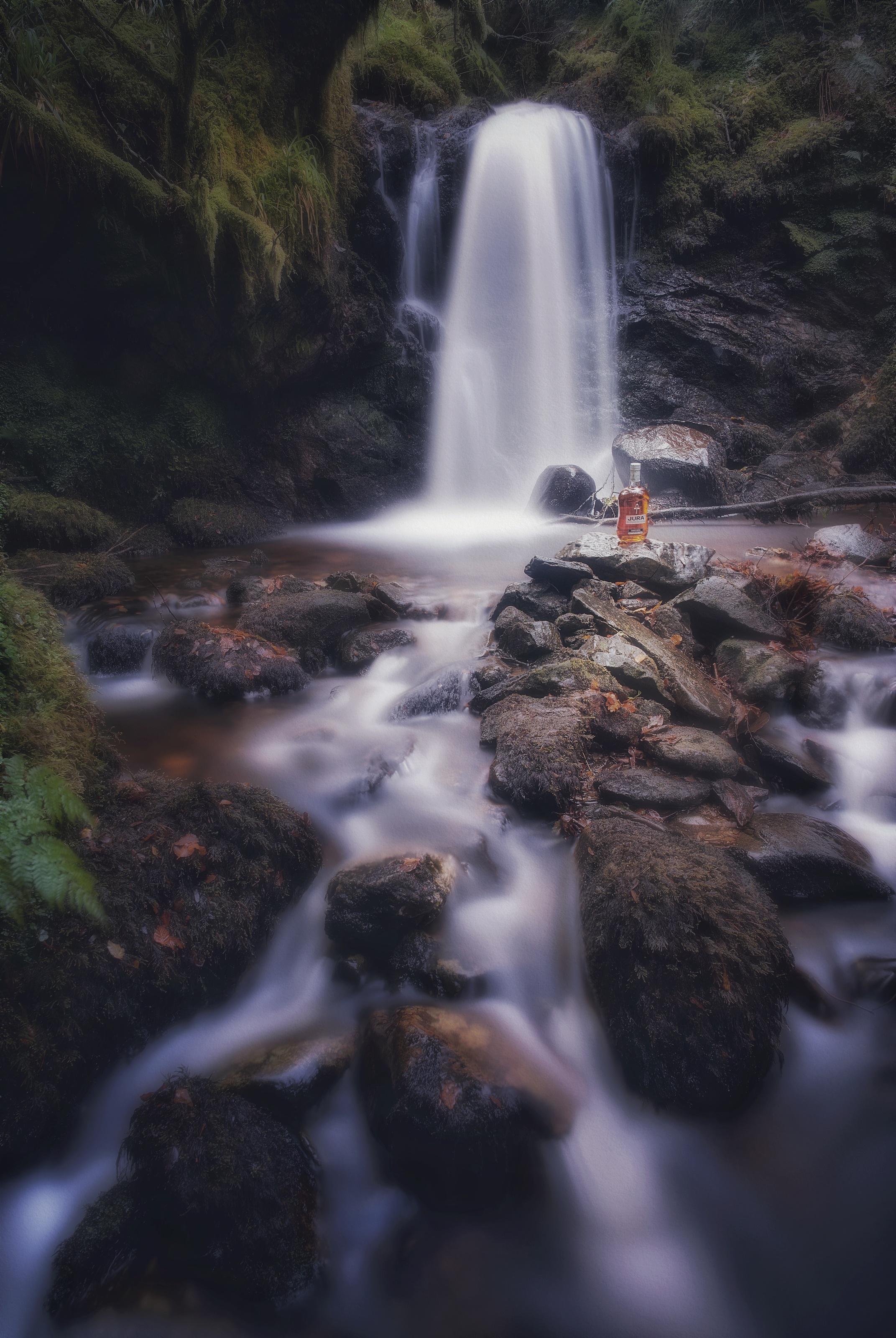
This time the organizer, Richard, had brought a couple of props – most notably a bottle of Isle of Jura Superstition and I had one or two ideas in mind “just in case” we ended up at a particular favourite waterfall.


We made our way down the slippery embankment to the burn, where I set up tripod amongst the boulders to maximize the lead-in lines of water flowing around the rocks up to the waterfall – tripod placement was fairly tricky with a wide-angle (24mm) lens and the slippery lumpy terrain to negotiate – and then as the camera was busy taking 20s exposures (4x with pixel-shift) I trotted back and forth through the water firing a flash-gun down onto the bottle of whisky and surrounding rocks (manual triggering at 1/8 power with the diffuser out and reflector down to stop the light itself registering in the scene).

Product Placement
I quite like Isle of Jura whisky… not necessarily on the rocks though.

I had originally experimented focussing in on the bottle itself and using a wide aperture to restrict depth of field, but that did not fall naturally through the scene – the waterfall was still sharp behind – so I stopped-down to make everything in focus and relied on post-processing tricks in Affinity Photo to draw the eye onto the bottle differently instead – some Orton effect and various soft-light Gaussian blurs, masks and elliptical gradient fills to boost the saturation, make it all glow and still leave the bottle sharp and bright. The final toning came from Snapseed of all things.

I’ve done a little product-photography before but never tried blending [bad pun intended] it with landscape work, let alone pairing it with light-painting, but I think it worked – certainly compared to the straight shot, the bottle with its amber glow just makes it.

The Return of Serif

It feels funny to think that back in the early 1990s Serif was known for PagePlus, in the days when such things were known as desktop publishing or DTP applications.

Recently, however, they’ve produced Affinity Photo for Mac, Windows and iPad. After one or two folks recommended it, I thought it was time to add another trick to the photo-publishing workflow and have a play. After all, if nothing else, having an iPad would solve my doubts with colour-management issues on Linux, wouldn’t it?

So I’ve spent a few weeks driving around hunting scenery and taking photos of it and gradually evolving a few routines: photos are still shot on the Pentax K-1; processed (variously pixel-shift or HDR) using dcraw on Linux, where I also run them through darktable for a lot of toning work; the results are then copied to an ownCloud folder which synchronizes automagically with the iPad; a bit of juggling with share-to-Affinity and share-to-Photos and share-to-ownCloud later and the results are copied back to the workstation for final organization, checks and publication.

Within Affinity, my workflow is to import an image and ensure it’s converted to 16-bit P3 colour-space – this is a bit wider than sRGB and native to the iPad’s display. I then run the Develop module which tweaks exposure, brightness and contrast, clarity, detail, colour-balance (not so much), lens distortions, etc. After that, I use layers to remove sensor-dust and other undesirable feature. Top tip, use a new pixel layer for the in-painting tool set to “this layer and below”; then all the in-paintings can be toggled on and off to see the effect; also use a brightness+contrast adjustment layer above that while you work, so the corrections will be even less visible when the contrast is reduced back to normal. If the image requires it, I’ll add one or two fill layers for gradients – better to use an elliptical gradient that can be moved around the scene than a vignette that only applies in the corners. Finally, I merge all the layers to a visible sum-of-all-below pixel layer,on which I run the Tonemapping persona; ignoring all the standard presets (which are awful), I have a couple of my own that make black-and-white in low- and high-key targets, in which I can balance local versus global contrast. If I produce a black&white image, it probably arises from this layer directly; sometimes, dropping the post-tonemapped layer into the luminosity channel makes for a better colour image as well (subject to opacity tweaking).

So, some results. It produces colour:

It produces black and white:

One final thing: I used to hate the process of adding metadata – titles and descriptions, slogging through all my tags for the most pertinent ones, etc. Because the ownCloud layer is so slow and clunky, it makes more sense to be more selective, choose fewer photos to go through it; if I also add metadata at this stage, I can concentrate on processing each image with particular goals in mind, knowing that all future versions will be annotated correctly in advance. Freedom!